Chess before
the first move

Historic chess pieces show how shape, contrast and scale make a set readable. Ten Met objects illuminate FIDE’s 2026 equipment principles.
This is a visual reading of the museum's public collection photographs and catalog records, alongside current FIDE documents, not a hands-on test of the objects. The photographs show particular views, sometimes in monochrome; they cannot establish weight, balance, feel or a complete set's performance under playing conditions. The historical objects are examples for understanding design, not recommendations to use fragile antiquities for a game. Their materials and uncertain dates are identified where relevant rather than treated as evidence of a single, uninterrupted standard.
An entire army can become a miniature world
The Met's chess set dated about 1800, made in India for a Western market, turns the board into a landscape of towers and mounted figures. Its catalog identifies lacquered wood and ivory. The collection photograph is monochrome, so the image does not demonstrate the red-and-white coloring described by the museum. It does demonstrate how much visual information can be packed into a small playing field: layered crowns, pierced architecture, riders and a floral border all compete for attention.
Look at the open central squares before looking at the tallest pieces. They form a comparatively quiet area between two crowded ranks. That empty space makes the carved figures easier to separate in this photograph; a dense middle-game position would present a different arrangement. This is an observation about the image, not a reconstruction of a documented match. The photograph is useful precisely because it lets a viewer distinguish the geometry of the board from the decorative language of the pieces.
A modern player might recognize a horse or tower quickly but hesitate over less familiar forms. That hesitation is not evidence that the set was badly designed for its original users. Recognition depends on conventions learned by a particular audience. Nor can a lavish surface tell us who actually played, how often, or whether this exact arrangement records a game. A collection photograph is an object record, not a score sheet. Keeping those questions separate prevents a beautiful image from becoming an invented story.
Why current equipment rules are about more than appearance
FIDE's equipment standards in force from March 1, 2026 call for Staunton-style pieces with clearly distinguishable forms and contrasting sides. The king's top must differ from the queen's, and the bishop must not be confused with a pawn. Recommended king height is 9.5 centimeters; square size is 5 to 6 centimeters. The standards also address proportions, stability and surfaces that avoid glare. These are requirements for contemporary competitive equipment, not a grading system for museum objects. Read the current FIDE equipment standards.
The practical idea is redundancy. Shape, relative height, side contrast and position should help the same identification rather than contradict one another. If a viewer needs a label to separate two pieces, the label is doing work that a competitive set is expected to do through its physical design. Conversely, a museum object may deliberately ask for sustained attention. Those are different purposes, so the useful question is not which object is universally better, but which task its design supports.
Imagine a casual game between people who learned with different sets. Before starting the clock, they could point out the king, queen, bishops and knights and check that both sides agree. That small conversation does not replace tournament regulations, but it exposes the underlying interface problem. A piece's meaning is not guaranteed by cost, ornament or age. It must be shared by the people using it. For an organized event, the applicable rules and the organizer or arbiter, rather than an article or a product photograph, determine what equipment is acceptable.
A pawn can be a compact sign rather than a figure

A small jet chess pawn in the Met collection, dated broadly to the ninth through fourteenth century and attributed to the Western Islamic lands, offers an almost opposite visual experience to the elaborate Indian set. Its dark, compact form has no little soldier to identify. Broad facets and a low silhouette give it a strong overall shape; chips and surface wear are visible in the photograph. The broad date range should remain broad. The image cannot narrow it to a particular year or match.
This object makes abstraction easier to understand. A symbol does not have to resemble the role it represents in order to function. A viewer accustomed to a different vocabulary may initially find it less obvious, while someone who knows the set's conventions may not. The same principle appears when a player moves between a physical board and a screen: recognition depends on a learned family of signs. That comparison does not establish that a historical pawn was designed with modern interface theory in mind; it is a present-day way to examine what the form asks a viewer to notice. For the digital side of that distinction, see our guide to testing actual player input in Godot, which separates a visible control from an interaction that works.
The photograph also shows why material and color should not be confused with side assignment. A dark stone object might suggest one side to a modern viewer, but a single surviving piece does not supply the original opposing army. Without the complete context, it is safer to describe what is visible than to fill in a missing partner. The pawn is an example of a compact sign, not proof of the complete visual system to which it once belonged.
A king whose outline carries the difference

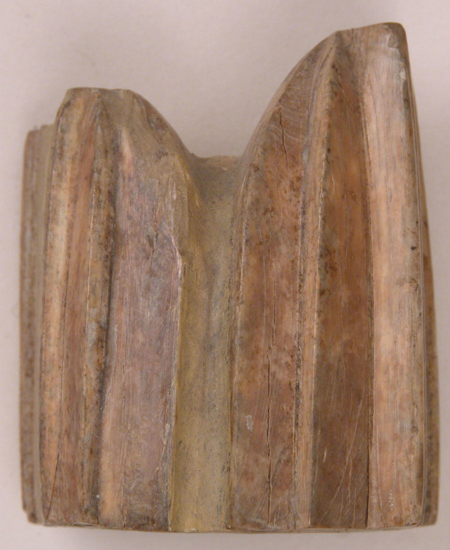
The Met's ivory chess king, dated to the eighth through tenth century and also assigned to the Western Islamic lands, has a block-like body with two raised ends and a central dip. The catalog identifies its role; the photograph alone would not make that role obvious to every contemporary player. Its value for this comparison lies in the relation between a simple mass and a distinctive top. A small change in silhouette can carry a large difference in meaning when a group of players knows the convention.
Surface texture complicates the reading in a productive way. Grain, cracks and changes in color draw the eye toward the object's age and material, whereas a player looking across a board would need the broader outline. These are two legitimate viewing distances. A museum close-up encourages attention to details that might be secondary during play. A game asks the viewer to recognize the object quickly among other objects. Neither perspective cancels the other, but they should not be collapsed into a single claim about usability.
The importance of the word “probably”

An unglazed earthenware object dated to the eighth through eleventh century is cataloged by the Met as a chess piece, probably a pawn. Its rounded shoulders, small top and incised decoration give it a readily grasped visual mass. The qualification matters. Dropping “probably” would turn a cautious identification into a certainty the museum does not claim. It would also encourage a reader to build a precise account of play on an uncertain starting point.
This is a useful discipline for anyone discussing games through surviving objects. The presence of a plausible game piece does not automatically reveal the complete rules, the surrounding set, the people who used it or the exact moves it could make. Each of those questions needs its own evidence. Here, the object contributes a different material and a different treatment of the top surface. It is not being used to settle the history of a rule or to prove that all objects with similar outlines served the same purpose.
Two knights, two ways to make a horse legible

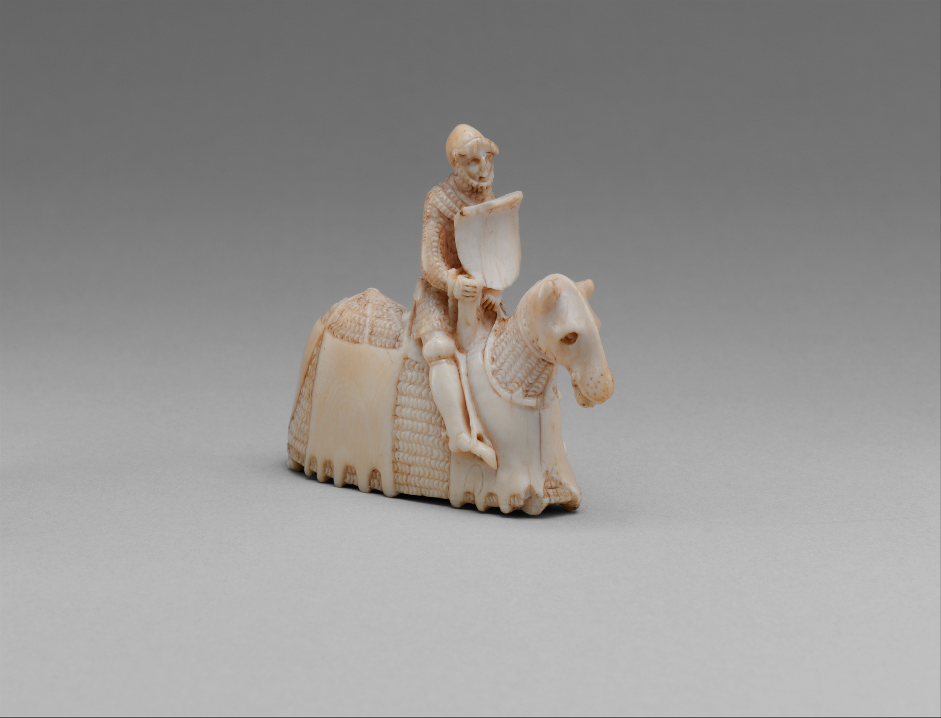
A mounted knight dated about 1350–60 in the Met collection shows a rider with a shield, a horse and carefully described equipment. The museum assigns it to Western Europe, possibly England, and identifies elephant ivory. The qualifier on the place remains part of the description. In the photograph, the broad body of the horse and the upright rider create a comparatively solid silhouette, while the carving within that outline rewards close inspection.
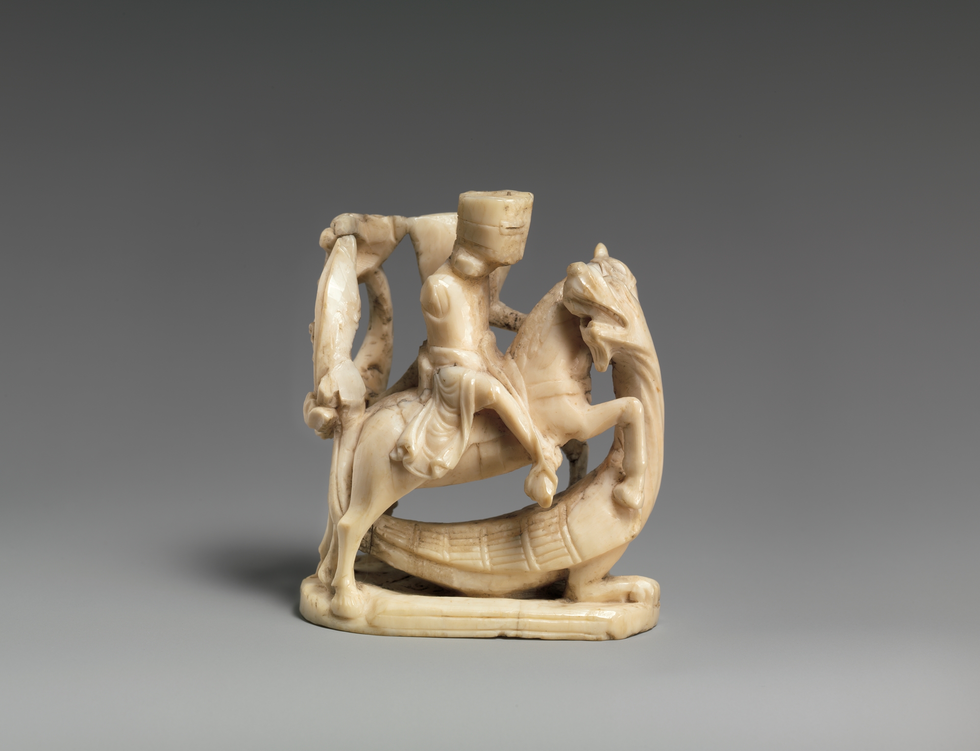
Another knight, British and dated about 1250, is carved in walrus ivory. Its rider and horse are arranged around open spaces, with a more visibly perforated silhouette. The two objects are not a matched pair and are not presented at equal scale. Their comparison is nevertheless revealing: both communicate mounted identity, but one emphasizes a compact mass while the other lets background show through. The outline and the internal details work together differently.
For a player, a horse-like form can provide a powerful recognition cue. For a viewer of these objects, the rider, shield and equipment add a second layer that is not necessary merely to name the chess role. That second layer is why reducing a historic piece to “an old knight” misses much of the object. At the same time, seeing a recognizable horse does not establish that every rule associated with today's knight was identical in the object's original setting. The physical resemblance is visible; the full rules of play require separate historical evidence.

A bishop as a seated person, not just a notch

The Scandinavian bishop dated 1150–1200 is one of the most immediately expressive objects in this selection. The walrus-ivory figure sits with ecclesiastical attributes, accompanied by smaller figures at the sides. The photograph makes the face, headgear and staff prominent. Rather than using a minimal sign alone, the carving provides a character whose identity can be read through costume and pose.
That makes it a good counterpoint to the modern design problem of separating bishop from pawn. A detailed figure may be rich in identifying cues when seen close up, yet many of those cues become smaller at board distance. A simplified symbol removes some narrative information in exchange for a more economical outline. This is not a claim that one historical form caused a later one, nor that a current set should copy this carving. It is a comparison between two ways of asking a viewer to recognize a role.
The board is another interface—and one object may hold more than one game

A seventeenth-century chess and backgammon board associated with the circle of Georg Schreiber presents amber, ivory, brass, gold foil and ebony as a spectacular playing object. The view reproduced here shows the backgammon side, with its long triangular points, not an eight-by-eight chess field. Calling this photograph a chess position would be a basic error even though “chess” appears in the object's catalog title. The caption and the visible face must agree.
An eighteenth-century wood, ivory and brass chess-and-goose-game board makes the same point in another way. The monochrome photograph shows a winding sequence of spaces rather than a standard chess grid. Its title identifies a multi-game object; the particular view identifies which surface we are looking at. A reader should not have to solve that discrepancy unaided. The two images are included to explain the distinction between an object's full function and the one face a photograph records.
That distinction has a contemporary equivalent. A reversible board, a digital platform or a tabletop collection may support several games, but the current layout still needs to tell the player which rules are active. Shared materials do not mean shared movement. A line of triangular points and a grid of squares organize attention differently. The useful question is what information the surface supplies, not merely whether the object is expensive or beautifully decorated.
The amber board's translucent-looking colors and contrasting borders are visually striking in the collection photograph. They should not be converted into a claim about glare under tournament lighting, because the image is a controlled photographic view. Similarly, the older monochrome image of the goose-game surface does not document its present colors. Describing these limits is not an apology for the pictures; it is part of reading them accurately. They show different systems of play, not interchangeable evidence of a single ideal chessboard.

When the army becomes a cast of historical characters

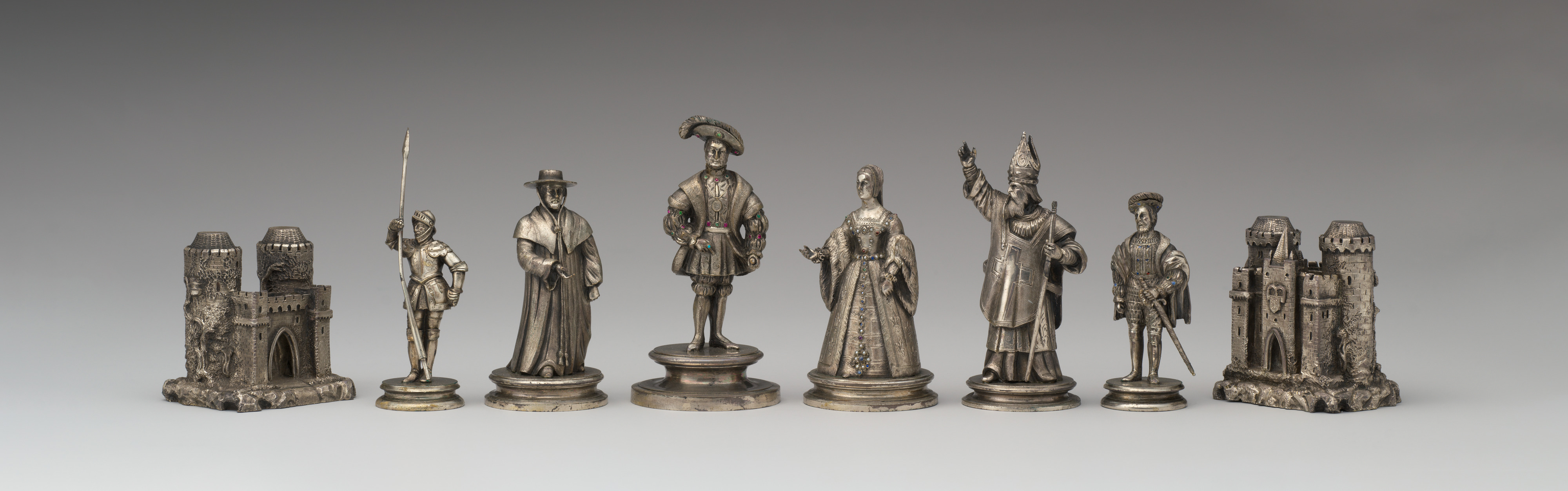
The Met's silver and silver-gilt chessmen known as the Field of the Cloth of Gold set date to the second half of the nineteenth century. Their title evokes an earlier historical subject; it does not make the pieces sixteenth-century objects. The photograph reproduced here shows a selection of figures rather than every piece in the cataloged set. Castles, standing people, headgear and elaborate clothing make the row resemble a miniature cast assembled for a scene.
This is the clearest example in the selection of a themed visual vocabulary. A castle is an especially direct cue, while some standing figures ask the viewer to distinguish roles through costume, stature or placement. The appeal of such a set may include recognizing its subject, studying the workmanship or enjoying the miniature figures. Those pleasures are not the same as minimizing the time needed to identify every piece in a crowded position.
For a casual game, players can agree on a themed vocabulary before play begins. For competitive equipment, shared standards reduce the need for that extra agreement. Neither observation requires treating ornament as a defect. It instead separates two design objectives: inviting interpretation and making identification immediate. The best discussion of a set begins by naming the objective rather than awarding a universal score from a photograph.
How to look at your own set without confusing beauty with clarity
Start with the piece that gives you the most hesitation, not the one that photographs best. Place it among neighboring pieces and look from the position where you actually sit. Can you identify its role without lifting it? Can you distinguish both sides under ordinary room lighting? Do the pieces leave enough visible space for you to read their squares? These are practical questions for a home game, not a substitute for an organizer's equipment requirements or a certification test.
Then separate three judgments. First is recognition: whether the players agree on what each piece means. Second is the physical experience, which requires actually handling the set rather than trusting a picture. Third is aesthetic pleasure, which may come from fine carving, material, a personal association or a playful theme. A set can be strong in one area and less suited to another. Saying so is more precise than calling an ornate set useless or a plain one uninteresting.
The historical photographs make these distinctions unusually easy to see. The abstract pawn concentrates attention on mass; the king uses a distinctive top; the mounted figures add narrative detail; the bishop turns role into character; the multi-game boards show that a surface determines what kind of play is visible. The silver figures and elaborate Indian set expand the game into a miniature world. Together they explain why equipment design is part of the experience before any tactical decision begins.
A readable board does not make the next move obvious. It makes the position available to be considered. That is the achievement shared conventions aim for: less uncertainty about what is on the board, leaving more room for uncertainty about what to do with it. The museum objects ask a different, equally rewarding question—how many forms can that familiar game take? Keeping those questions distinct allows a player to appreciate both a practical modern set and the imaginative range of its historical counterparts.





Comments
Post a Comment